Seeing Before Coding, Doodling Before Doing: How Teaching Data Visualisation Transforms the Way Students Think
critical-thinking, alternative-assessment
The Unexpected Course
The scene is set: In a dining room in China, at a kitchen table in Scotland, in a library in Canada, students boot up their laptops, turn on their devices, and come online. In a seminar room in Edinburgh, students file in and take their seats, computers at the ready. Most are postgraduate students — many of them coming from quantitative, scientific, or health backgrounds across the University of Edinburgh. They are individuals interested in and comfortable with numbers, analysis, and programming. They have signed up for a course called Data Visualisation: Knowledge Transfer: most have not read the fine print, and they come expecting to write code.
More often than not our students arrive expecting to learn about new chart types, to take a deep dive into Python or R visualisation libraries, or to discover some other innovative programming activity involving dashboard design. To their surprise, and sometimes horror, they are presented with a pen, a pencil, a piece of paper, and a whiteboard (or the online equivalent). This is not an accident, a resource shortage, or a pedagogical quirk. It is the entire point. From the very first session, the course does something radical as it asks technically capable postgraduate students to put down their keyboards and pick up a pen. It asks them to slow down, to think, to doodle, to draw, to sketch. It asks them to become, possibly for the first time in their postgraduate careers, deliberately and productively uncomfortable and uncertain and, ultimately, it changes forever the way they see data.
This chapter presents a story of transformation by offering some insights into what the course Data Visualisation: Knowledge Transfer does, how it does it, and why, at a moment in time when generative AI can produce a bar chart from a prompt in seconds, it matters more than ever that our students can see before coding and doodle before doing.
The Problem With Jumping Straight to Code
There is a seductive logic to the idea that learning data visualisation means learning to code visualisation. After all, programming tools are powerful, expressive, and fast. A student who knows how to use a Python or R visualisation package can produce a scatter plot in minutes; they can iterate, tweak, re-render, and they can handle thousands of data points with ease. So why do we not start here? Indeed, why do we not go here at all? The answer is that programming tools, for all their power, are also ‘cognitive cages’. From the moment a student opens a coding environment, they are limited. Constrained by the chart types the tool offers, the parameters it accepts, the defaults it imposes. The tool shapes their thought. A student reaching for a data visualisation tool will, almost instinctively, reach for a line chart or a bar chart not because these are the right choices for the data or the audience, but because these are what the tool offers first. With this, the creative space collapses before it has even had a chance to open.
This is not the only problem, though, as beyond the constraints of the tools, there is a deeper issue at play. An assumption that visualisation is primarily a technical act rather than a creative and communicative one. When students think about making a chart, they are often thinking about rendering data correctly. They are not thinking about who will read it, what that reader already knows, what question is being answered, what knowledge they want to uncover, what information they want to impart and, least of all, what feeling might be evoked, or what story might be being told. These questions are not peripheral to data visualisation. Indeed, quite the contrary, they are its heart and as such, the course begins from the position that you cannot become a truly skilled data visualiser by learning programming alone; rather you must first learn to see and think … and doodle.
The Power of Pen and Paper: Doodling and Sketching as Cognitive Liberation
The introduction of ‘pen and paper’ as a core component of this course is its most distinctive and powerful feature. It comes as a genuine shock to many students. Sometimes there is even visible discomfort with students expressing that this is not quite what they signed up for, or that the analogue medium is not only unexpected but perhaps even somehow beneath the sophistication they have spent years developing. There is discomfort on display, the ‘niggle’ is at work … and growth is on the horizon.
When you doodle, draw, sketch, you are freed from the tyranny of precision for a pencil line does not require you to specify axis labels, font sizes, or colour hex codes; it asks only that you think about shape, about relationship, about proportion and flow. It invites you to add embellishments, indeed, to add whatever you like. The rawness of a hand-drawn sketch is not a deficiency; it is a feature. It signals that this is an idea, not a product, and it invites iteration and critique in a way that a ‘polished’ visualisation does not.
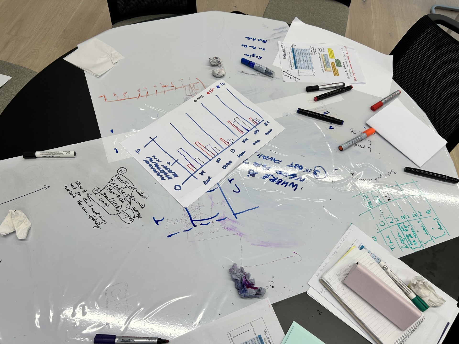
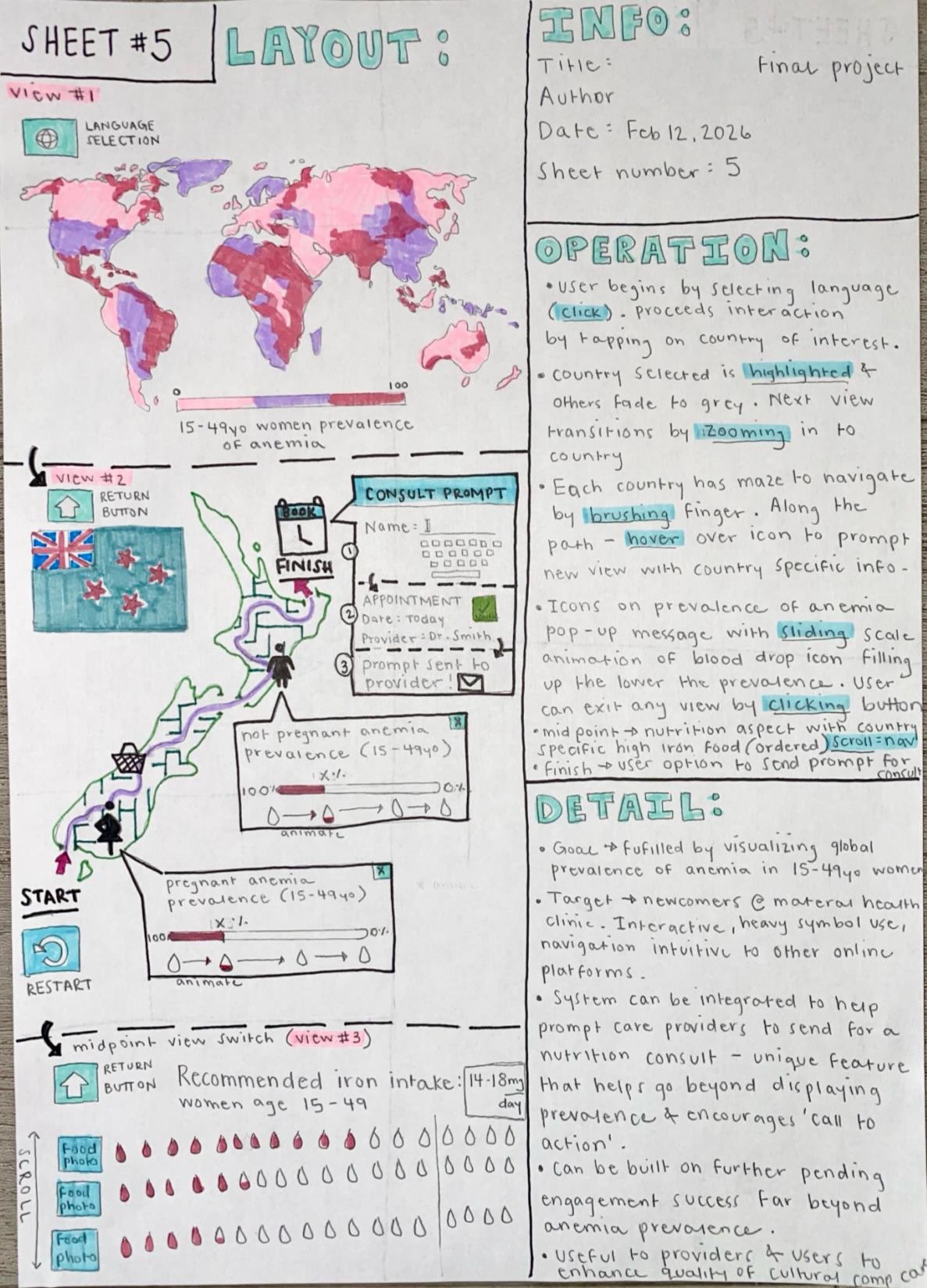
In practice, the course builds ‘pen and paper’ work into every stage of the design process. Students are asked to sketch multiple candidate visualisations for a given dataset producing rough thumbnails of layouts, where they experiment with spatial arrangements, try out different encodings (position, size, colour, shape etc.), all with nothing more than their hands, a pen and a sheet of paper, or a whiteboard (see Figure 28.1, Figure 28.2).
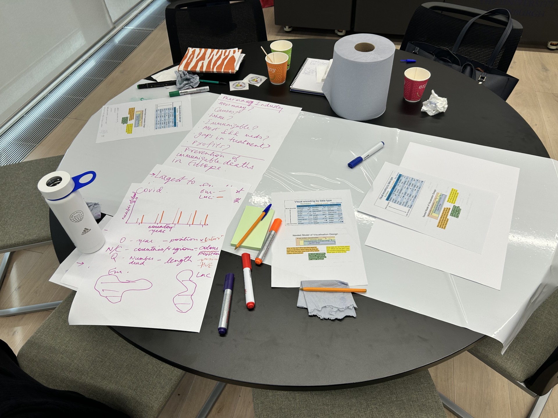
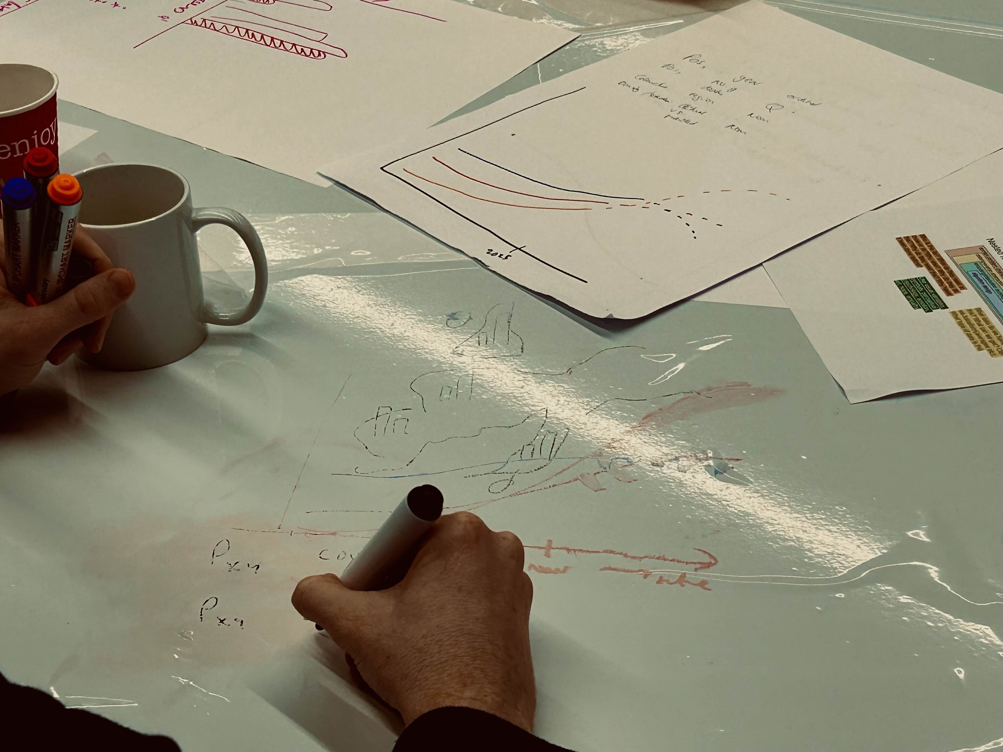
They annotate their sketches with notes about their intended audience, their narrative goals, the emotions they want to evoke, and then they categorise and filter their sketches. As the course progresses so to does the depth of engagement and interrogation of these ideas (see Figure 28.3, Figure 28.4).
Supporting students through this process requires care, especially for those who feel their drawing skills are inadequate. For this reason, it is important to emphasise early and often that this is not about artistic quality – the doodles, the drawings, the sketches themselves are not being judged. The goal is ideation, not illustration. A visualisation sketch can consist of boxes, arrows, and rough axes. It can include figures and symbols, whatever the student wants, whatever their creativity allows; it does not need to be beautiful. One practical strategy that works well is the ‘quick sketch challenge’ where students are given a dataset, asked to identify an audience and a goal, and given approximately ten minutes to produce as many different visual representations as they can, without overthinking or self-censoring. The time pressure liberates them from perfectionism and opens a space for unexpected ideas.
Following this initial ‘quick sketch’, the sketches are critiqued through a modified ‘gallery walk’, where students are asked to share their sketches on the whiteboard, in the case of online students, or in the classroom, pinned to a wall, or spread out on desks. The students ‘visit’ each sketch, either leaving ‘sticky-note’ comments on each other’s work or, if the group is small enough, sharing comments in real time. This activity transforms the individual exercise into a collaborative conversation, normalising the rawness of the work, and building a shared vocabulary for discussing what makes a visualisation effective or ineffective. Students begin to articulate, often for the first time, why a particular choice works, or even how elements from different options could come together to work even better.
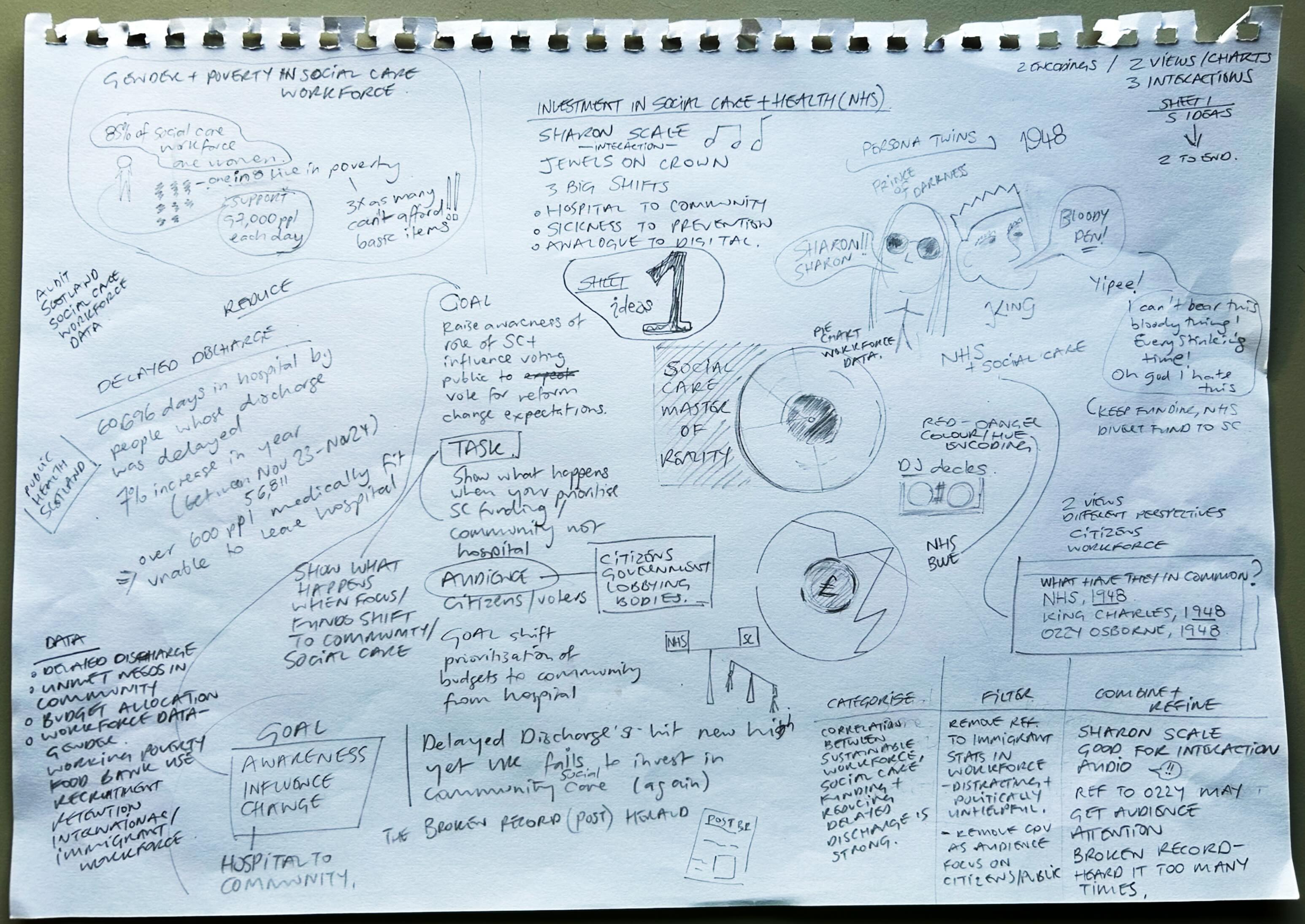
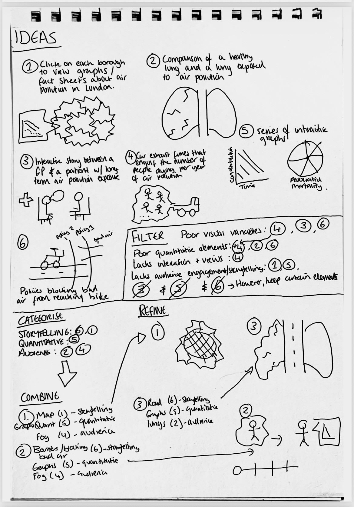
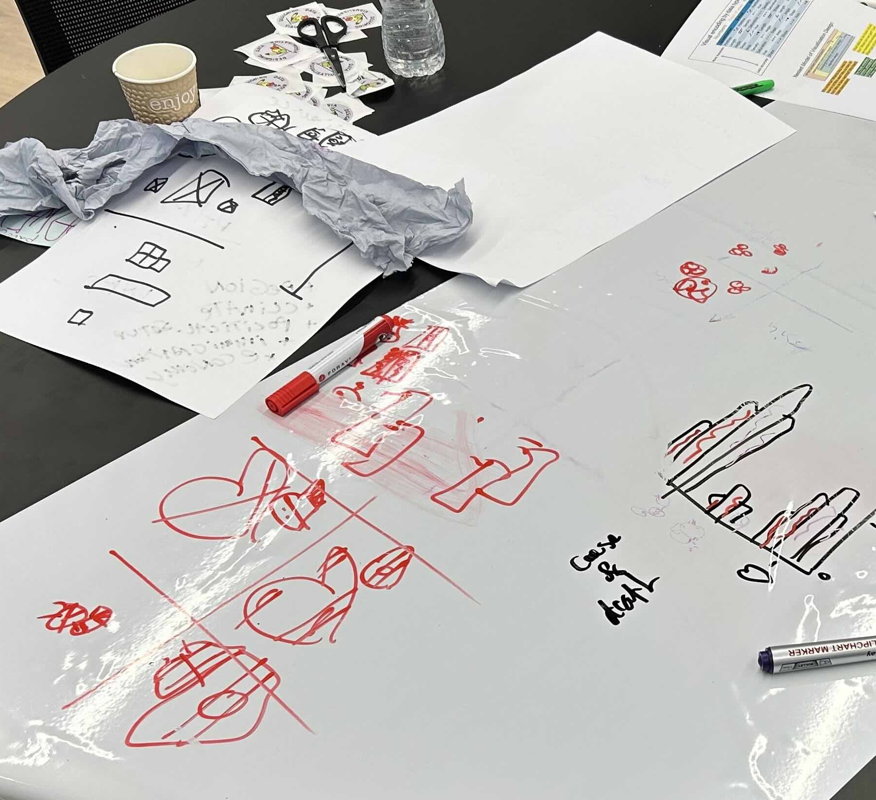
This engagement, sharing, and articulation are where deep learning happens, and for many students ‘pen and paper’ turns out to be transformative in a way they had not expected. Students have stated that this step has changed the way they approach problems more broadly, and by the end of the course many report that they now sketch before they code, think through the design before worrying about the implementation, and seek to consider every component and aspect of the visualisations they create or view (see Figure 28.5, Figure 28.6, Figure 28.7). The pen, it happens, is not a step backwards but rather a step deeper.
Theory as a Foundation: Bertin, Tufte, and Munzner
The sketching, doodling and ideation work does not happen in a vacuum and is underpinned by a rigorous engagement with the theoretical foundations of data visualisation. These foundations, once understood, give students a language for making and evaluating their design decisions and the decisions of others. The course begins with Jacques Bertin, the French cartographer and theorist whose 1967 work Sémiologie Graphique remains one of the foundational texts of visualisation theory (Bertin, 1983).
Bertin (1983) identifies, what he calls, visual variables, which are the fundamental perceptual properties used to encode information. These are position, size, shape, value (lightness), colour hue, orientation, and texture. His message is that not all variables are equal, with some better suited to encoding quantitative information (position and size are highly effective), while others work better for categorical distinctions (shape, colour hue). Understanding Bertin’s visual variables means understanding the grammar of visual encoding, and once students have this grammar, they have the means to analyse any visualisation they encounter with a clarity and precision not previously possessed. While there have been many additions and variations made to Bertin’s original work (and this is ongoing in this developing area of research), in this course the aim is to keep it as easy and workable for the students as possible with their focus on learning and using Bertin’s visual variables as their foundation.
The course also introduces students to Edward Tufte, whose work is in many ways the ‘aesthetic conscience’ of data visualisation. Tufte’s principles of data-ink ratio, ‘chart-junk’, small multiples, and the lie factor, are not merely stylistic prescriptions, but also ethical commitments (Tufte, 1983). Tufte argues, compellingly, that a poorly designed visualisation is not just ugly; it is dishonest, it misleads readers, distorts understanding, and wastes attention. His concept of ‘chart-junk’ (the visual clutter that adds no informational value) resonates powerfully with students. Encountering Tufte can feel like a minor revelation where suddenly less is not just more in the aesthetic sense, it is also more from an ethical perspective. Of course, we do discuss the exceptions to these rules (see Lang (2009), for example) and challenge students to consider this and when it might be proper to break these rules.
The third major theoretical framework the course introduces is Tamara Munzner’s nested model of visualisation design, first articulated in her 2009 paper and later expanded in her seminal textbook (Munzner, 2009, 2014). Munzner’s model is particularly valuable for students who are learning to think creatively and systematically about design decisions. It proposes four nested levels of the design process: characterising the domain problem and the data, abstracting those into visualisation tasks and data types, designing the visual encoding and interaction idioms, and finally implementing the algorithms and data structures (students do not realise this fourth level in this course). For students, it is not only what the model offers but how it functions that is important because the nested design model identifies that a mistake can occur at any level and that a mistake made at an outer level will cascade inward, invalidating all the work that follows. Munzner’s model is a theoretical scaffolding that teaches students to question their assumptions at every stage, to ask not just how to create a visualisation but whether the visualisation they are creating is the right one for the task and for the audience. This is not a question that programming tools or AI tools ask. It is a question that only a thoughtful practitioner can ask if they have learned how to ask.
Woven throughout this visualisation theory is an engagement with perceptual psychology. Visualisation is a perceptual act where data is visually encoded and then decoded by a human’s visual system, which has particular strengths and limitations. Drawing on foundational work in the field (Ware, 2012), students learn about pre-attentive processing (the fact that certain visual properties such as colour, size, and orientation are detected almost instantaneously, in parallel, and before conscious attention is engaged), and the implications of this for design. They learn about the limits of human working memory, about the gestalt principles of visual grouping, about how colour is processed differently depending on whether it encodes categorical or quantitative information. This knowledge does not just make them better designers; it makes them more attentive ones. The human visual system is extraordinary, but it is also fallible and biased, and a visualisation that ignores its limitations is a visualisation that will fail its audience (Mandal, 2003).
Storytelling and Audience: The Communicative Imperative
If theory gives students the vocabulary and doodling and sketching gives them the freedom, the course’s emphasis on storytelling and audience gives them their purpose. A visualisation is always a communication. It is always made by someone, for someone, about something, in service of some goal. The moment students internalise this, not as an abstract idea but as a design constraint that shapes every decision, their work changes dramatically.
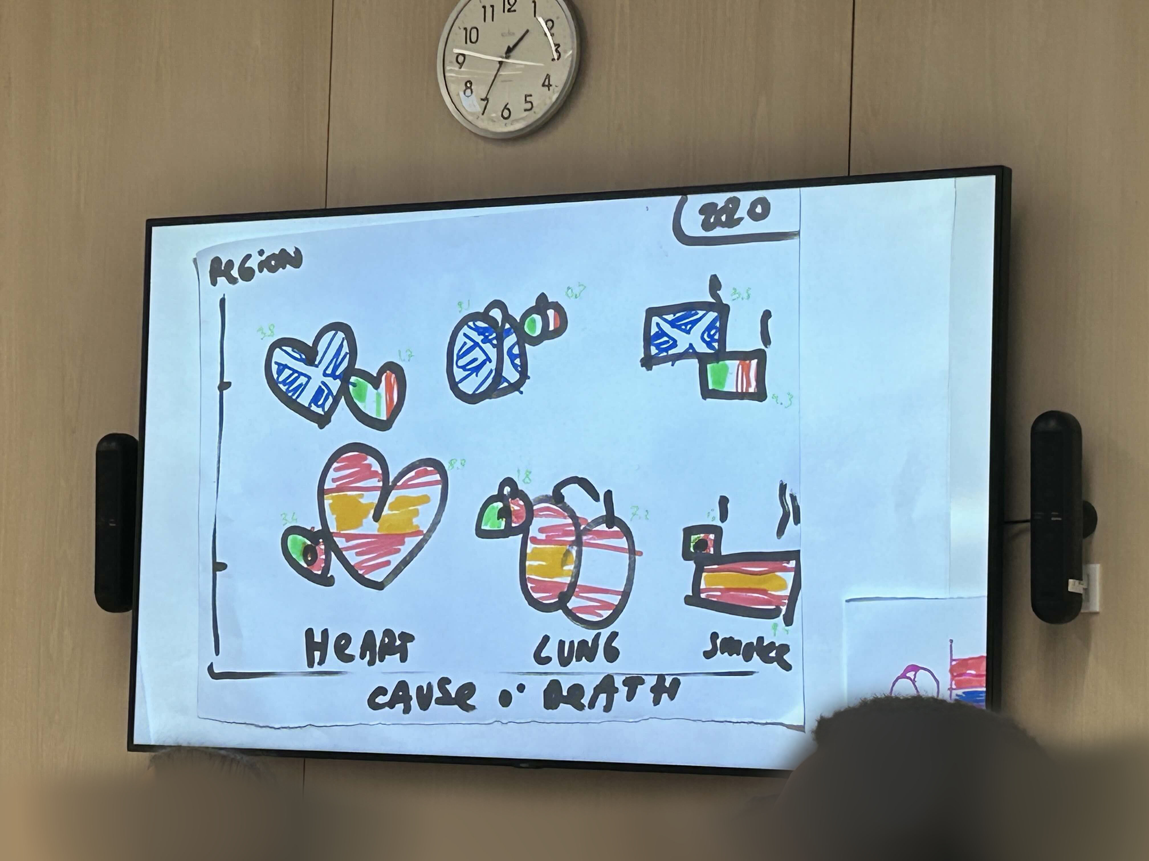
Audience is one of the key concepts that the course begins with on day one and returns to again and again. Different audiences bring different prior knowledge, different expectations, different emotional responses, and different purposes. In the specific context of health and social care data these distinctions carry a great deal of weight. A visualisation designed for a room of clinical specialists or public health researchers needs to do completely different work from one designed for patients, carers, or a general public audience, even if both are communicating the same underlying data. The specialists can handle complexity, density, and technical annotation; the general audience needs clarity, guided narrative, and context (see Figure 28.8, Figure 28.9). Getting this wrong is not merely a stylistic failure. It is a communicative failure which, in health contexts, can contribute to genuine misunderstanding and poor outcomes.
This course, therefore, does not treat audience as a single spectrum from novice to expert, as to do so would run the risk of missing out vital elements. Instead, students are taught to approach audience with curiosity. Not only who are the audience, but also what is the audience doing? Are they exploring data freely, forming their own questions and following their own paths? Or are they being presented with a specific argument, guided through a specific narrative? These two modes, one exploratory, the other explanatory, require fundamentally different design approaches. An exploratory visualisation needs interactivity, flexibility, and rich detail while an explanatory one needs clarity, focus, and narrative momentum. Many students arrive never having made this distinction before, and making it opens up an entirely new dimension of design thinking, which for many is transformative.
Storytelling, in this context, is not about imposing a narrative on data, rather it is about finding the truthful, meaningful shape of a dataset, the arc of change over time, the contrast between groups, the outlier that demands explanation, and presenting these things in a way that guides the audience towards understanding. The best data visualisations have a kind of rhetorical structure beginning somewhere, developing towards a point, and leaving the reader with something they did not have before. Students learn to ask, “what is the one thing I want my audience to take away from this?” before they begin their design doodling. This single question, explored and answered, transforms the entire process.
Practical activities support student learning and help them appreciate the importance and complexity of audience and goal. For example, students are asked to present visualisations they have designed to each other and to explain the narrative they intended, then to compare that intended narrative with what their audience actually took away. The gap between the two is almost always instructive. It reveals the biases we hold and the assumptions we make about what is obvious, what needs labelling, what requires annotation, what needs changing altogether. It teaches that what is clear to the maker is not always clear to the viewer and that this gap is the data visualiser’s responsibility to close.
Critical Thinking as a Superpower
One of the most significant outcomes of the course, and one that students themselves often identify as surprising, is the development of critical thinking skills that extend far beyond data visualisation. The combination of theory, practice, audience awareness, and reflective practice that the course requires supports students to become not only more skilled visualisers, but also more thoughtful practitioners of data science in general.
Critical thinking, in this context, means the capacity to question the choices embedded in any artefact. To ask not just whether it works but whether it is the right thing to create, for whom it is being created, and what end it serves. Students learn that data visualisations are not neutral. Every design choice, what to include and exclude, how to scale axes, which colour palette to use, whether or not to add symbols, whether to annotate an outlier or let it speak for itself, whether interactions are required and what these might be, how they might be used and the impact they might have, is a choice that encodes assumptions about what matters and who will ultimately understand it. Students who have worked through Bertin’s visual variables and Tufte’s principles and Munzner’s nested model, and have engaged with perceptual theory and the imperatives of understanding audience, are, by the end of the course well-equipped to ask questions with a rigour that students who have only learned to code are not.
The habit of critique, once established, is generative. Students who have learned to analyse and question visualisation design are in a position to transfer these skills to their study more broadly. They are more likely to question a technical output that seems analytically sound but communicatively misconceived. They are, in short, more conscious practitioners because they have learned to think, to see, to question … and to doodle. There is a developing creativity to be seen in students who have been through the process of doodling and sketching, of generating multiple solutions to a design problem before committing to any of them. These students begin to develop a fluency with divergent thinking that serves them across study and work domains. They are less likely to accept the first solution they think of, or are presented with. They are more comfortable with ambiguity and iteration, they demonstrate a higher tolerance for productive uncertainty, and they begin to see that creativity has a very central and important place in programming.
Future-Proofing in the Age of Generative AI
It would be easy, in 2026, to ask whether a course about data visualisation needs to teach design thinking when generative AI tools can now produce a working chart from a natural language prompt in seconds. Type a description into a capable AI system and you will have something render-ready almost instantaneously. If the code can write itself, why should students spend time learning to think about design? The answer, paradoxically, is that generative AI makes this kind of teaching more important, not less. The bottleneck in data visualisation has never been the ability to write code. It has always been the ability to think about what to create. A practitioner who can prompt an AI system to produce code is only as capable as their underlying design thinking. If they do not know that a bar chart is the wrong choice for this data and this audience, the AI will produce a bad bar chart very efficiently. If they do not know that the colour palette they have chosen is inaccessible to people with colour vision deficiencies, the AI will generate those inaccessible colours without hesitation. The code is the easy part, the thinking is the hard part, and it is the part that no AI can do for you.
So, in a world where AI can produce competent, adequate visualisations on demand, the value of truly excellent visualisation thinking increases dramatically. Competence is no longer scarce, but what is scarce, and will likely become scarcer, is the kind of deep understanding that allows a practitioner to produce visualisations that are not just technically correct but genuinely illuminating, genuinely communicative, and genuinely ‘fit for purpose’.
There is also a need for critical literacy as AI-generated visualisations proliferate in public health communications, in policy documents, in clinical and even in research publications. The ability to evaluate and critique these visualisations becomes an even greater necessity. A practitioner who has worked through Bertin and Tufte and Munzner, who has doodled and drawn, who has sketched dozens of alternative representations of a single dataset, who has presented their work to an audience and encountered the gap between intention and reception, who understands perceptual theory and how they apply, is well-placed to look at an AI-generated visualisation and ask the right questions. They will identify the misleading axis, the inappropriate chart type, the missing context, the distorted scale, the perceptual inadequacies, the missing audience.
Data Visualisation: Knowledge Transfer is a course that takes an active approach to future-proofing by positioning itself not to compete with AI tools but to develop the human capacities that AI cannot replicate. Students who complete this course are better positioned to work with AI-powered visualisation tools than those who have only ever learned to code – they know what to ask for, how to evaluate what they receive, and how to push beyond adequacy towards excellence.
Seeing Differently: The Lasting Transformation
The most powerful testimony to the value of this course comes from the students themselves, and it tends to take a particular form. They do not say that they learned new tools or mastered new techniques, though they do those things too. What they say, more often, is that they now see differently:
“Prior to this course, my undergraduate background led me to believe that data visualisation was only concerned with selecting the correct type of graph for a given dataset. My understanding was limited to presenting data in its rawest form, without considering how it might be communicated to the public or how they may interpret it. I now realise the power and influence data visualisation holds in communicating public health issues.” - Student 1
They look at a visualisation in a health report, a scientific paper, or a public dataset release, and they cannot help asking the questions they have been trained to ask. Whose audience is this for? What story is being told? What encoding choices have been made, and are they the right ones? What has been left out, and why?
“I can no longer look at visualisations the same way. I find myself looking and thinking, hmmm that is not really the best encoding if you want the audience to act on this. This could be so much more effective if…” - Student 1
“I now have an increased awareness of my own position when critiquing visualizations and understand that like in art, some of the most memorable pieces occur when the artists vision resonates deeply with viewers as the piece delivers some form of universal experience with the users. Though the individual experiences may be different, the messaging is clear, which is what makes it impactful.” - Student 2
The course aims to produce not just students who can make good visualisations, but students who understand, at a deep and principled level, that visualisation is a form of knowledge transfer, a communicative act, a designed object that encodes both data and values. Students who understand this are better data scientists and better analysts because they understand the human dimension of everything they create:
“I challenged myself to move away from my natural instincts and reliance on line graphs and bar charts and to apply my developing understanding of visualisation principles, such as storytelling and emotive encodings. I found this to be an intensive learning experience as it encouraged me to explore multiple combinations and ideas, which is something I have never done before when creating graphs.” - Student 1
The experience of this course demonstrates that creativity is not a talent you either have or don’t have; rather it makes clear that creativity is a skill that develops through practice, through the willingness to step outside of one’s ‘comfort zone’, and the ability to open up one’s mind and find value in the generation of imperfect ideas and learn from them. Students who arrive believing that they are not creative people (a belief that many data-focused students hold) often leave having revised that self-assessment entirely. They have discovered that creativity is not only or always about producing something beautiful from nothing, but rather it is about asking good questions, generating multiple possibilities, and making principled choices:
“At times I found myself feeling stuck or insecure as I did not feel ‘creative’ enough to create something meaningful. However, this process forced me to think outside of how I normally do and push myself, which I really enjoyed.” - Student 1
Throughout the course students learn to be conscious practitioners who are aware of what they are doing and why, who can articulate the principles behind their choices, and who can evaluate their own work and the work of others with genuine rigour:
“[T]he goal of the final visualization was to inspire motivation within the users by being able to see themselves in the data, engage with the idea[s]… and advocate for themselves by increasing feelings of empowerment. In using affective visualization techniques, the final visualization optimizes users’ engagement through exploring different sensations, narratives, and behaviours within the given context…The visualization allows messaging based on users’ choices. They choose the setting, and the visualization encourages interaction through play. The activity enhances the storytelling as it symbolizes a journey from displaying … information, to suggesting what the user can do with the information…” - Student 2
In the field of health and social care data, where visualisations shape how clinicians, policymakers, and the public understand outcomes, inequalities, and risk, that consciousness is not a luxury, it is a responsibility.
Conclusion: The Pen as Portal
There is something quietly radical about a course that begins by asking postgraduate students to put down their computers and pick up a pen, to draw and to doodle. It runs against the grain of a discipline that tends to value and promote technical sophistication, to measure progress in terms of tools mastered and programmes learned. Data Visualisation: Knowledge Transfer asks students to be uncertain, to be slow, to be raw and exploratory in an educational culture that often rewards precision and speed. Yet, the radicalism of this is inseparable from its value. By stepping back from the keyboard, students gain access to a creative and critical space that programming tools cannot fully offer. By engaging with the theories of Bertin (1983), Tufte (1983), and Munzner (2009, 2014), students acquire a vocabulary for thinking about visual communication. By attending to perceptual psychology (Ware, 2012), audience, and narrative, they develop an understanding of visualisation as a human act, not merely a technical one. And by sketching, doodling, annotating, and critiquing, they build the habits of active, reflective practice that will serve them for the rest of their careers:
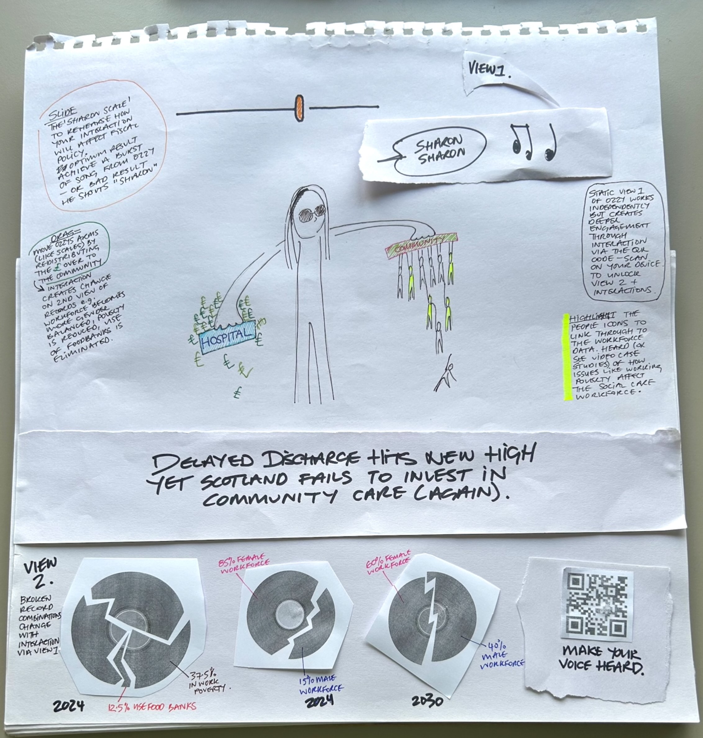
“Initially, I viewed data visualisation as a neutral tool, focusing on clarity and function, but I now appreciate the power of emotionally driven storytelling. My final visualisation embodies this shift. Instead of conventional graphs, I used cultural iconography and metaphor, choosing Ozzy Osbourne to represent NHS and social care funding imbalances. Born in 1948, the same year the NHS and social care were established, Ozzy’s chaotic yet beloved public image mirrors the precarious state of social care today…This course has given me the confidence to embrace a more human-centred and creative approach to data visualisation. I will use this in my work…” - Student 3
Data Visualisation: Knowledge Transfer is, at its core, a course about learning to see. It teaches students to see data, not as a collection of values to be rendered, but as a story waiting to be told. It teaches them to see their audience, not as a passive recipient of information, but as an active participant in a communicative act. And it teaches them to see themselves not only as technicians, but as designers making creative, responsible, and effective choices. In the age of generative AI, when the code can write itself, learning to see is more important than ever. The best tool for learning to see is not a programming environment or an AI assistant instead; it is a pen, a piece of paper, a whiteboard, and a willingness to think, to challenge … and to doodle.
Acknowledgements
I would like to thank and acknowledge the work and inspiration of my friend and colleague Dr Shane Sheehan whose enthusiasm, knowledge and undying curiosity and belief in the visual inspired and realised the development and growth of the course that this chapter is based on. I would also like to thank Dr Pawel Orzechowski for his support with this course in its most recent iteration. His enthusiasm and playful approach to teaching and learning has added yet another exciting dimension to this course. Also, a very big thank you to all who have participated in this course over the years. It is your enthusiasm together with your experiences that have helped shape this course and bring it to where it is today. Finally, a very heartfelt thanks to the students who so willingly and generously allowed me to include their work and reflections in this chapter. They bring the story of this course to life. Thank you!